

In the east side of Seattle, tucked in a run-down, forgotten strip mall, Broiler Bay has been serving simple burgers and fries since 1989, and almost everything has stayed the same since (prices too). The unassuming, old-school vibe is the charm of Broiler Bay; they still write their tickets by hand and make everything to-order. They don’t post any advertisements, only take orders by phone, and are in fact, so old-school they don’t even have a website!
And that’s where we come in: an easy ordering system on a simple, classic website - just like their burgers!
research
In this economy, it’s harder to run a small-business as ever, so you need to use every trick in the book to stay afloat. For Broiler Bay, a website is essential, not only for an internet presence but to make it easier for customers to learn more about them. Also, currently with just a phone-ordering system, rush-hours could be frustrating, so an easy, online-ordering system would make everybody’s lives easier as well
Problem
To learn more about the context of the market, as well as what users are looking for, we decided on 2 research methods
Research

Competitive Analysis

User Interviews
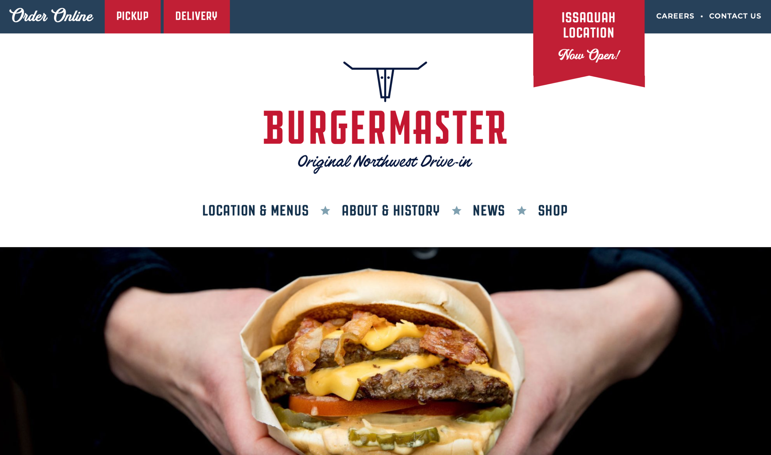
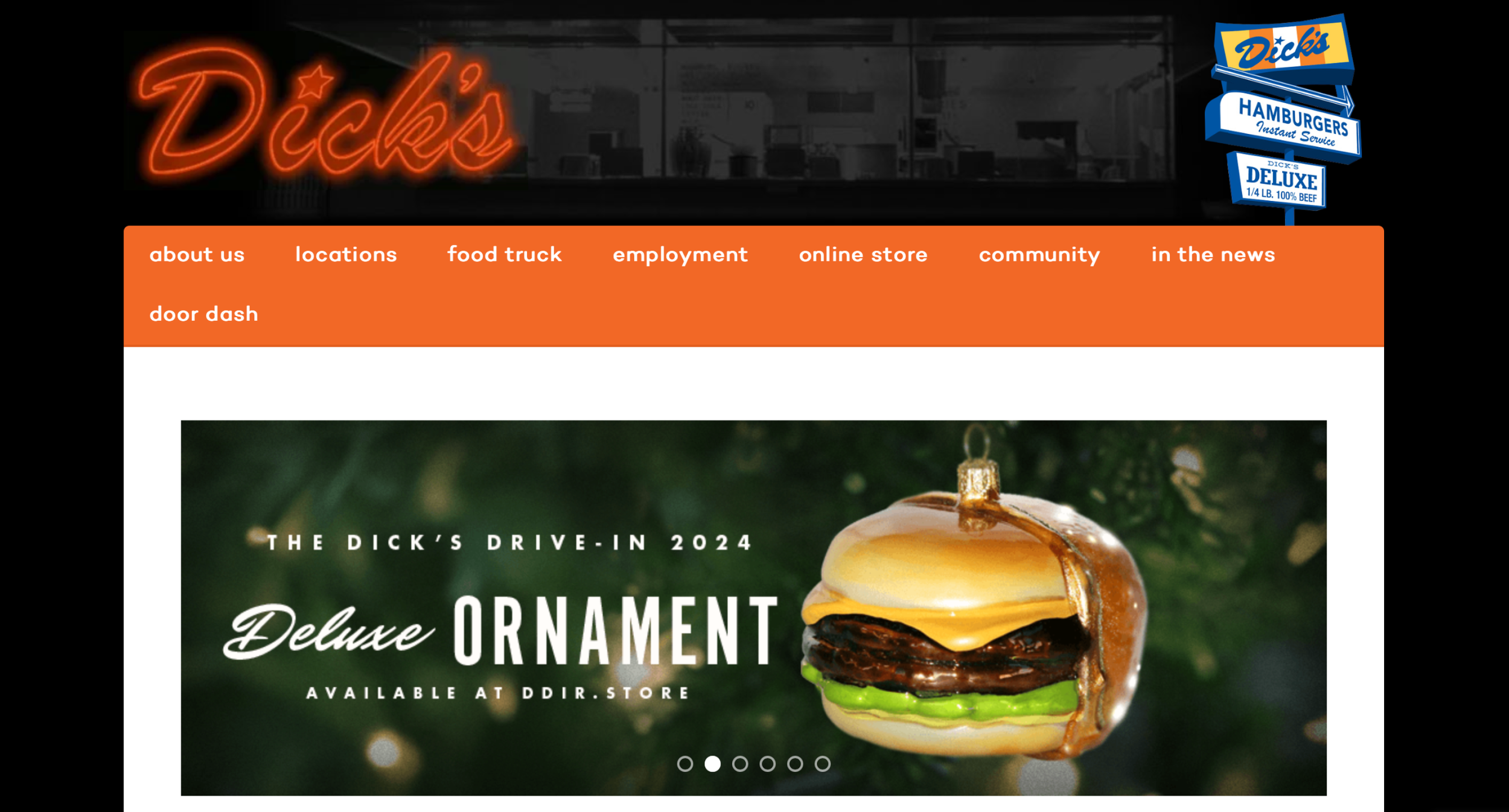
Competitive Analysis

After analyzing competitors and seeing the context of the market, I conducted interviews with 5 people of various ages, backgrounds, and interests in food
User Interviews
Key questions include asking about personal experiences and preferences with:
How often do they order food or eat out
Thought processes behind trying new restaurants
Experiences with restaurant websites
Research Takeaways + Insights
Burger joints differentiate themselves through quality of ingredients, store hours, and local reputation, such as how well they treat their employees and branding
Word of mouth is by far the biggest motivator for people to try new restaurants, as well as trusted influencers, food critics and bloggers

People always look online before trying a new restaurant or ordering online, whether to check Yelp, Google reviews, or general reputation. People almost never try a new restaurant blindly

People often check a restaurants website for addresses, menus, or online ordering options, as well as seeing the branding or overall aesthetic. It is always part of their research routine

For burgers, the majority of people prefer ordering online for pickup because it saves money and makes sure the food doesn’t get cold

analysis
Personas


As a customer, I need a more accurate way of finding information about the restaurant, so I can learn about the business, what they’re offering, and make a confident decision to order
As a customer, I need a more direct way of ordering food online, so I can have a more convenient method of ordering and have a smoother experience
POV
HMVs
How might we connect with customers easier so they will be able to learn more about our brand?
How might we communicate business information to customers so they will be able to find and know about our product better?
How might we develop an online ordering system for customers so they will be able to have an easier experience placing orders?
Solution
Based on research findings, user interviews, as well as the opinions of the store owners, we decided that a simple website with only the necessary features will be best, including an online-ordering system and a menu. As the business grows, more features and pages can be added later
ideation
In order to organize the ideas before designing the wireframes, a ranking was made to help prioritize which features we would include in the MVP
Feature Set Prioritization
Menu with Up-to-Date Prices
Address
Unique Branding and Aesthetic
Online Ordering Feature

Social Media Presence
Articles, Reviews, and Blog Posts


Newsletter
Merchandise
Blog / News
Careers
Community Events
Task Flows
#1: Exploring the Main Page
Users start at the landing page, and scroll through to explore until landing on the menu at the bottom

#2: Placing an Online Order
Clicking the “Online Order” button brings the user to the online ordering feature, where one can add items to a cart, add payment information, and receive a confirmation for in-store pickup

early wireframes
User Flow 1: Exploring the Main Page


the user starts at the landing page, with a promotion of the new online ordering feature, and scrolls through the content until the menu, with a conveniently placed order button
User Flow 2: Updating the Personal Size Passport

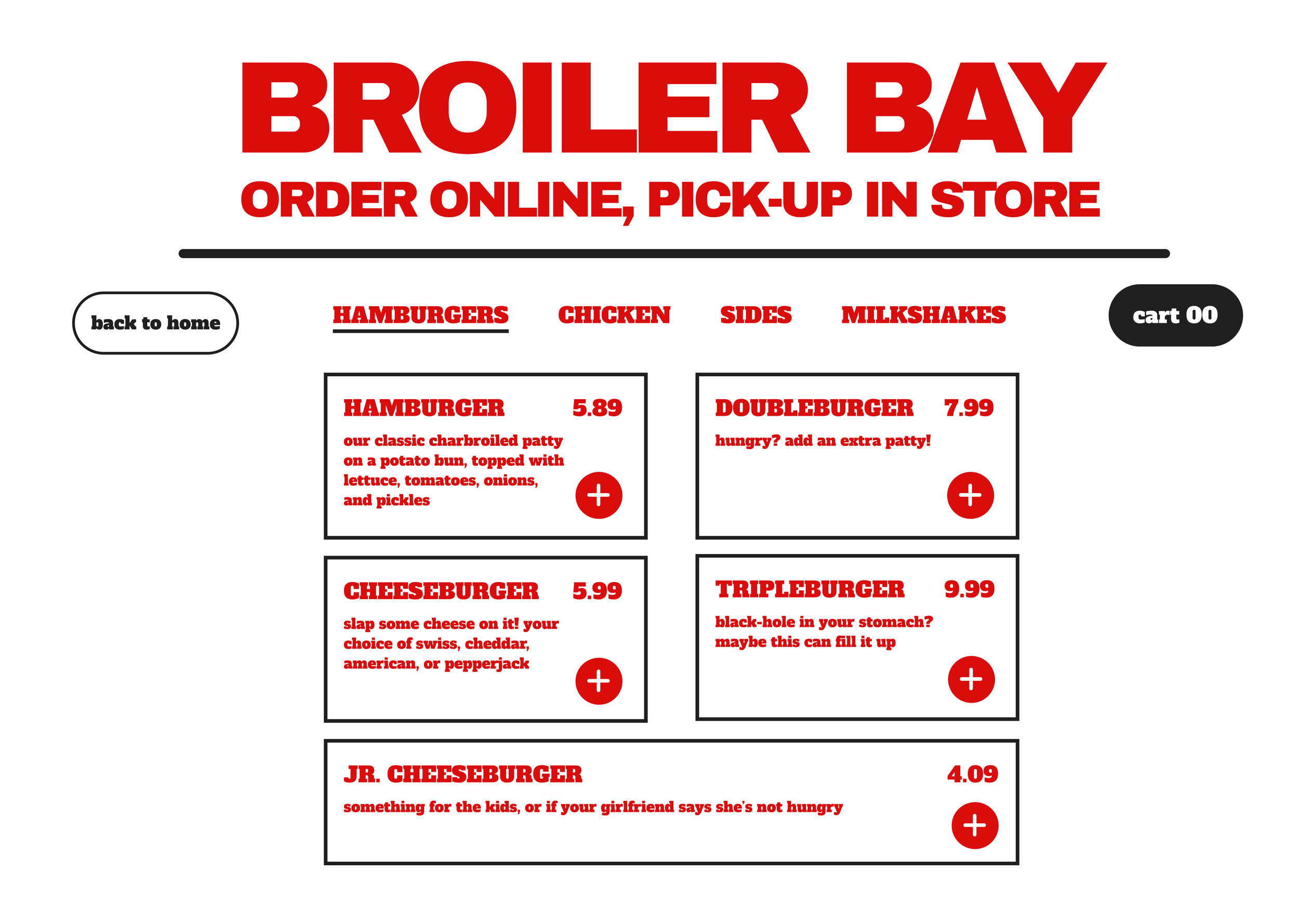


in the process or ordering, the user goes through adding items to a cart, including add-ons such as toppings, then continuing through to payment/contact information and finally ending at the confirmation page with an estimated time
testing
This test will be conducted by 5 participants, and they will be selected from the previous group of interviewees in the research phase so they will be familiar with the project and objective
Test Plan
Objectives
Observe efficiency in completing tasks
Observe how users navigate the design
Evaluate ease of use
Identify problems for revision
What is Success?
Users don’t need additional hints to complete the task
Users can complete the task in a timely manner with little or no errors
Overall rating out of 5, for ease of use and design
Results + Key Takeaways
In this case study, the wireframes were more fleshed out, because in the previous case study, the lack of pictures and colors were slightly confusing. This test went much more smoothly
Testers mentioned that because of the all red color-scheme, some buttons were lost in the text, and nothing stands out, especially important buttons like “back” or “home”, which took them longer to find
The main complaint was the aesthetics of the site and ordering feature. Everything being all red and bare made it seem unfinished or unprofessional
Iteration
Based on usability tests and user interviews, we focused on these few points for our next iteration:
complete redo of the aesthetics, using more imagery and less items for a more minimal and professional look
change of fonts and colors for a cleaner presentation
placement of buttons for clearer navigation
final product

Introducing
A brand new introduction from an old classic. Browse the menu, learn their story, and order their goods all in one convenient place!
A local cult-classic, now with a brand new website!
Loved by food critics and locals alike, Broiler Bay has always been tucked away in the outskirts of Bellevue, known only by word-of-mouth. However, with a modern website, customers can now look up menu items, learn about their story, and even order online for pick-up!