
Surfers Against Sewage is a marine conservation group created by surfers in the UK in the 90s. Their relentless campaigns for improved water quality has earned them recognition by the EU legislation, the national government, as well as corporate brands like Patagonia who have supported and sponsored them. As global warming continues, it is evermore important to educate the public and bring awareness to this issue before it’s too late
In this volunteering job, my task was to consult and make redesign suggestions to the fundraising section of their site, in order to improve conversions and increase donations
research
While Surfers Against Sewage has successfully created national awareness of ocean pollution, it still encounters fundraising roadblocks, and we wanted to help its fundraising page achieve 2 goals:
Problem
Help users understand the cause more directly and clearly, and take learn of ways to take action
Increase contributions and donations from the fundraising section of the website
In order to understand the problem on a deeper level as well as see examples of websites that are converting, we’ve decided to use 3 main methods for our research
Research

Secondary Research

Site Analysis

Comparative Analysis
Secondary Research
According to a study done by Giving USA, only 3% of total donations are given to environmental causes, even though 2 out of 3 Americans believe that climate change is a major threat to our planet and agree that our government has done little to take action. So why is that? Studies have given us 2 main reasons:
Overwhelming amount of information has led people to be confused about personal responsibility vs donations. Many marketing campaigns have advocated people to become more aware of their personal use of resources, but many studies also say corporations are responsible for most of the pollution. The lack of clear objectives have people apathetic about next steps
People aren’t seeing the effects of their contributions, so they are less encouraged to donate. Climate doom is an term that has popularized recently to describe the hopelessness of climate change, and has led many to think that their contributions won’t change anything
Comparative Analysis
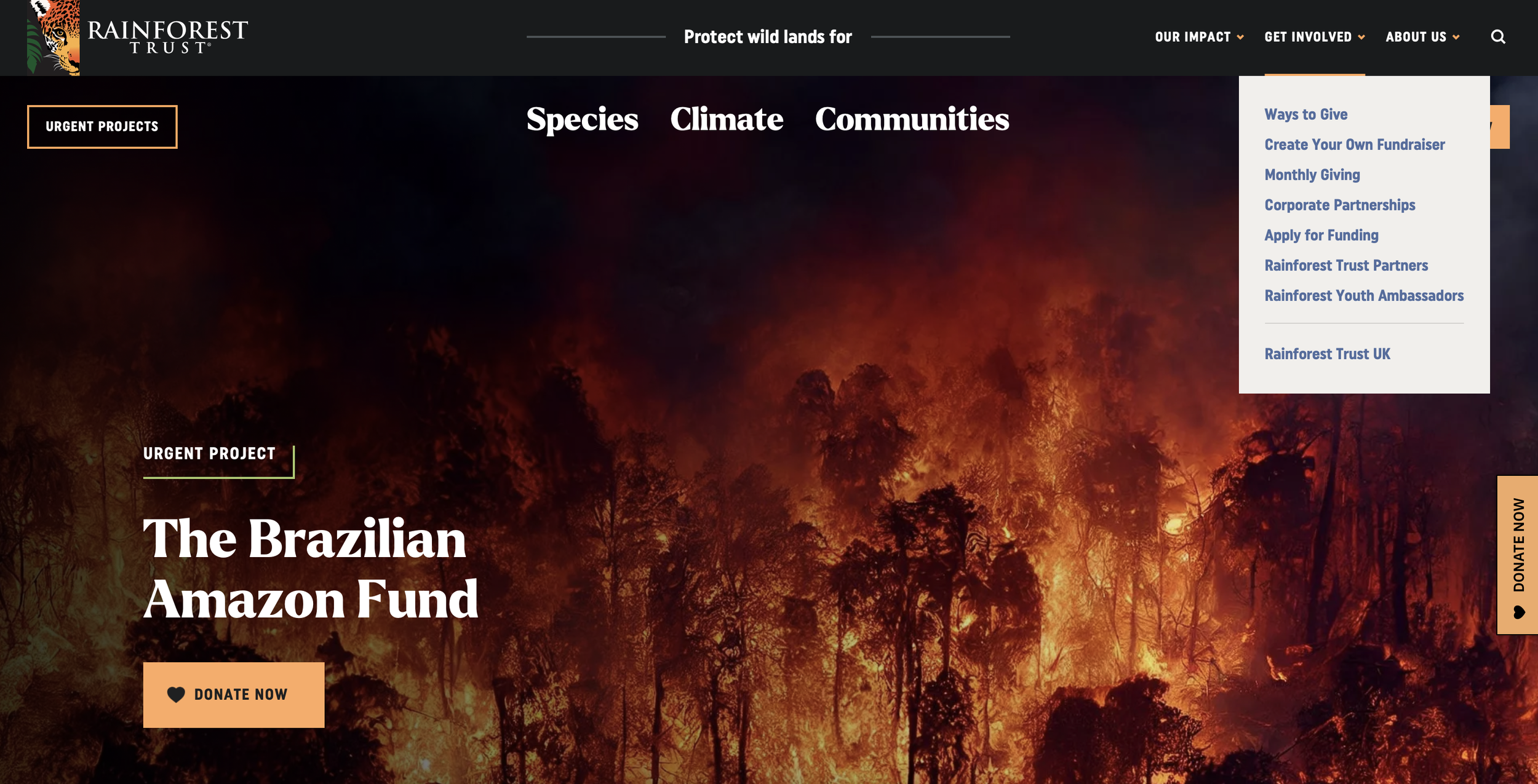

We’ve taken a look at multiple websites by some of the most popular environmental non-profit organizations, including Rainforest Trust and Friends of the Earth, and we’ve seen some patterns in their UX design and compared to that of Surfers Against Sewage’s
Visible and brightly colored call to action buttons to donate. Some websites have multiple scattered throughout the website
A more condensed “take action” or “get involved” dropdown menu, with clear titles to describe the individual sections
Clear information hierarchy, with either one concentrated direction or an even spread of options, making it easy to understand and navigate
Mission statements and main objectives in the hero section to make sure the user understands the goal of the foundation


Current Site Analysis

Multiple calls to action and sections with more information. Oftentimes this causes confusion as to where to go first and distract from the main objective
No clear mention as to where the money would go to, which might discourage people who feel uneasy about donating
No strong information hierarchy - all sections are flat and even, which makes navigation unclear and difficult
We took a look at the fundraising section of the website to determine any first-impressions and what could be improved in terms of user conversion, and we’ve discovered a few issues:
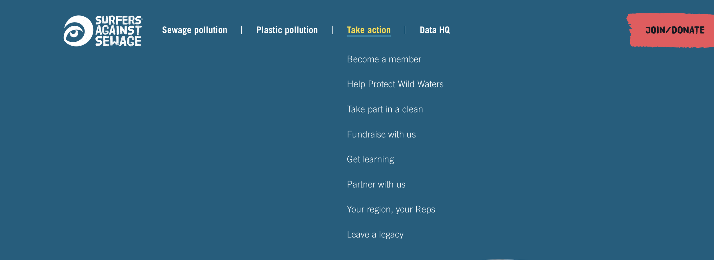
In the dropdown menu for taking action, there are quite a few options, some which are clearly defined, but some which are not and seem redundant. The amount of options there are with no clear direction can seem confusing for a first time user
ideation
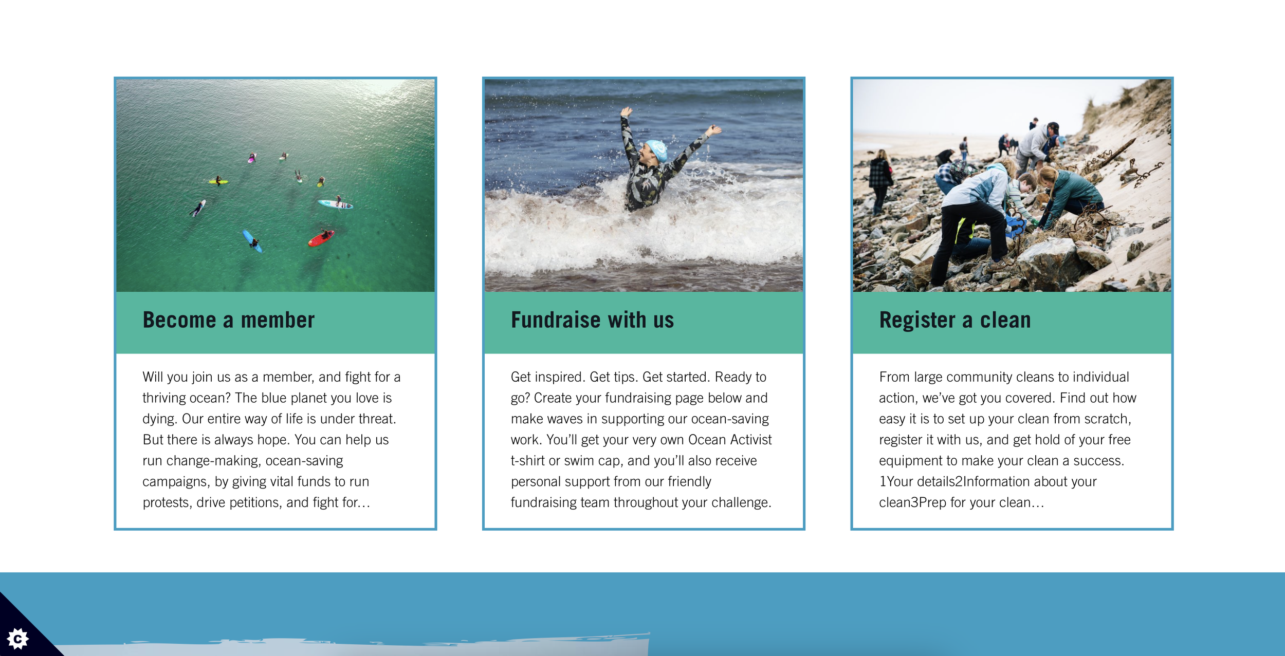
More concise menu that narrows down topics and makes navigation less confusing
Clear information architecture - a main call to action as the focal point of the page
Instead of a long scrolling page of side-topics, condense the actionable activities to make it easy to understand and choose
Quick explanation of how the donated time and money affect the cause and how to learn more
As we sketch the main page, we want to make sure to include these points based on our analysis and research:
Design Focuses

Wireframing
By organizing the information architecture by priority, we begin with the main call to action - the donation / membership link. Then we show more different calls to action such as beach cleanings or education activities, and ending by reiterating how important the cause is and appreciation of the sponsors
final design
before

after

Condensing the dropdown menu options by eliminating clashing topics and combining similar topics makes the organization clearer and less confusing to a first-time user, which will encourage donations
before


after

With our research and analysis, we learned that users not only appreciate simple and to-the-point calls to action, they also want clear direction and affirmation of how their contribution will help the cause. This design starts with a direct call to action, with other suggestions of how to take action, as well as a short paragraph explaining how they’re making a difference. With this more focused design, users will be immediately encouraged to donate and take action
next steps
Moving forward, I think redesigning the rest of the website would be helpful for the organization. By condensing and reorganizing the information in a more user-friendly way, the website will encourage users to donate more often and take action. I believe more research methods including user and usability tests will reveal more data and direction of how to organize the website
Even though the redesign of the fundraising page was just a small part of the site, we hope it will spread to the rest of the site. Environmental causes are more important than ever today, and we will all benefit from more education and calls to help
What’s Next
Key Takeaways
The importance of research. The majority of the time spent in this project was on research, so I learned a lot about different research methods and the difference in information each type gives. If there were more time, we would want to use a bigger variety of research methods, such as surveys and journey mapping to learn more ways to refine the design
I have experience with redesign projects before, but never in this scope working directly with stakeholder. I learned how to more effectively communicate my ideas as well as receive feedback, and translate that feedback into design. As I work on bigger projects, I will gain more experience in stakeholder management, and will improve on how to better present and communicate my ideas
